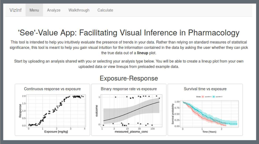
Humans are notorious at seeing patterns in plots even when there are none, especially when there is some incentive (e.g. financial) to do so. To avoid these pitfalls, the lineup protocol (Buja et. al 2009) calls for generating a number of simulated (“null”) plots and asking a user to try to pick out the real data from the rest. We created an R-shiny App that allows the user to generate these lineups by using preloaded examples or by uploading their own data.
Read more →

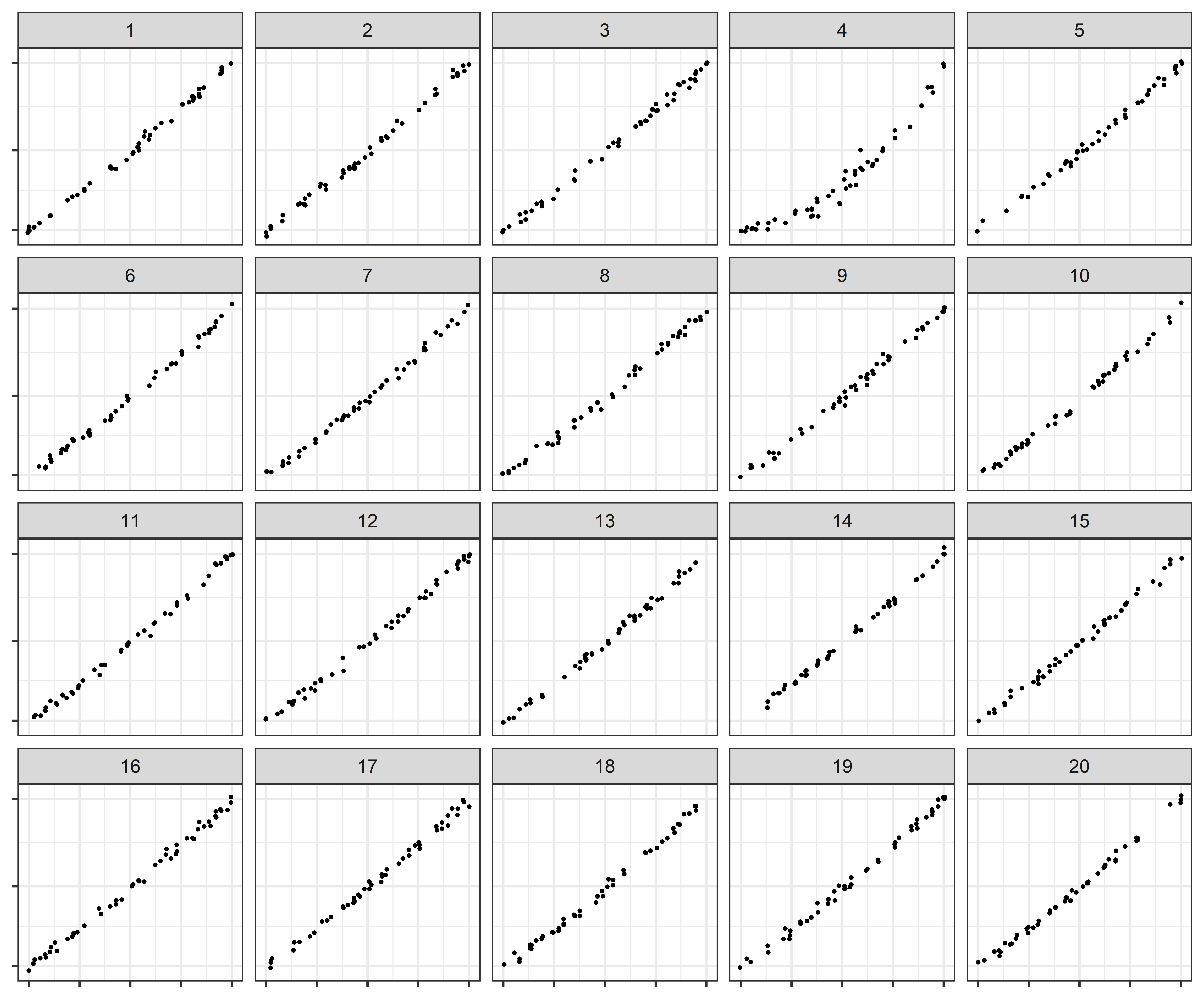
How do statistical regression results compare to intuitive, visually fitted results? Fitting lines by eye through a set of points has been explored since the 20th century. Common methods of fitting trends by eye involve maneuvering a string, black thread, or ruler until the fit is suitable, then drawing the line through the set of points. In 2015, the New York Times introduced an interactive feature, called ‘You Draw It’, where readers are asked to input their own assumptions about various metrics and compare how these assumptions relate to reality.
Read more →
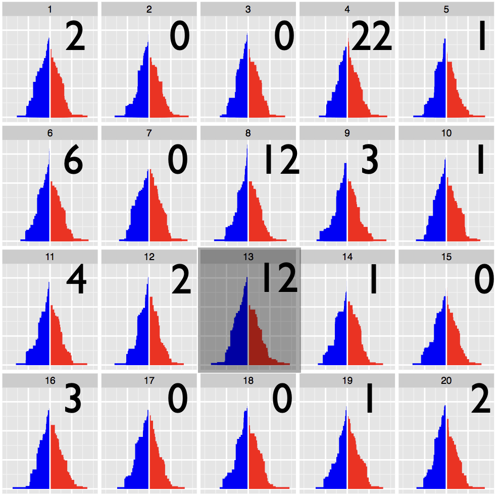
Statistical inference provides the protocols for conducting rigorous science, but data plots provide the opportunity to discover the unexpected. These disparate endeavors are bridged by visual inference, where a lineup protocol can be employed for statistical testing. Human observers are needed to assess the lineups, typically using a crowd-sourcing service. In this talk we will discuss how to calculate statistical significance associated with the results from applying a lineup protocol.
Read more →

Past studies - Subjective Judgment in Statistical Analysis: An Experimental Study (D.J. Finney; 1951) and Eye Fitting Straight Lines (Mosteller et. al. 1981) - conducted graphics experiments to evaluate human perception of fitting best fit lines by eye through a set of points or a given trend. We bring this experiment into the modern era with r2d3, following a similar process to NYTimes You Draw It pages. In previous research, we conducted a graphical experimental task using lineups and visual inference to evaluate whether our ability to perceptually notice differences in exponentially increasing trends is impacted by the choice of scale.
Read more →
Log scales are often used to display data over several orders of magnitude within one graph. During the COVID-19 pandemic, we have seen both the benefits and the pitfalls of using log scales to display case counts. We explored the use of linear and log scales to determine whether our ability to notice differences in exponentially increasing trends is impacted by the choice of scale. We conducted a visual inference experiment in which participants were shown a series of lineup plots (consisting of 19 null panels and 1 target panel generated by differing model parameters) and asked to identify the panel that was most different from the others.
Read more →