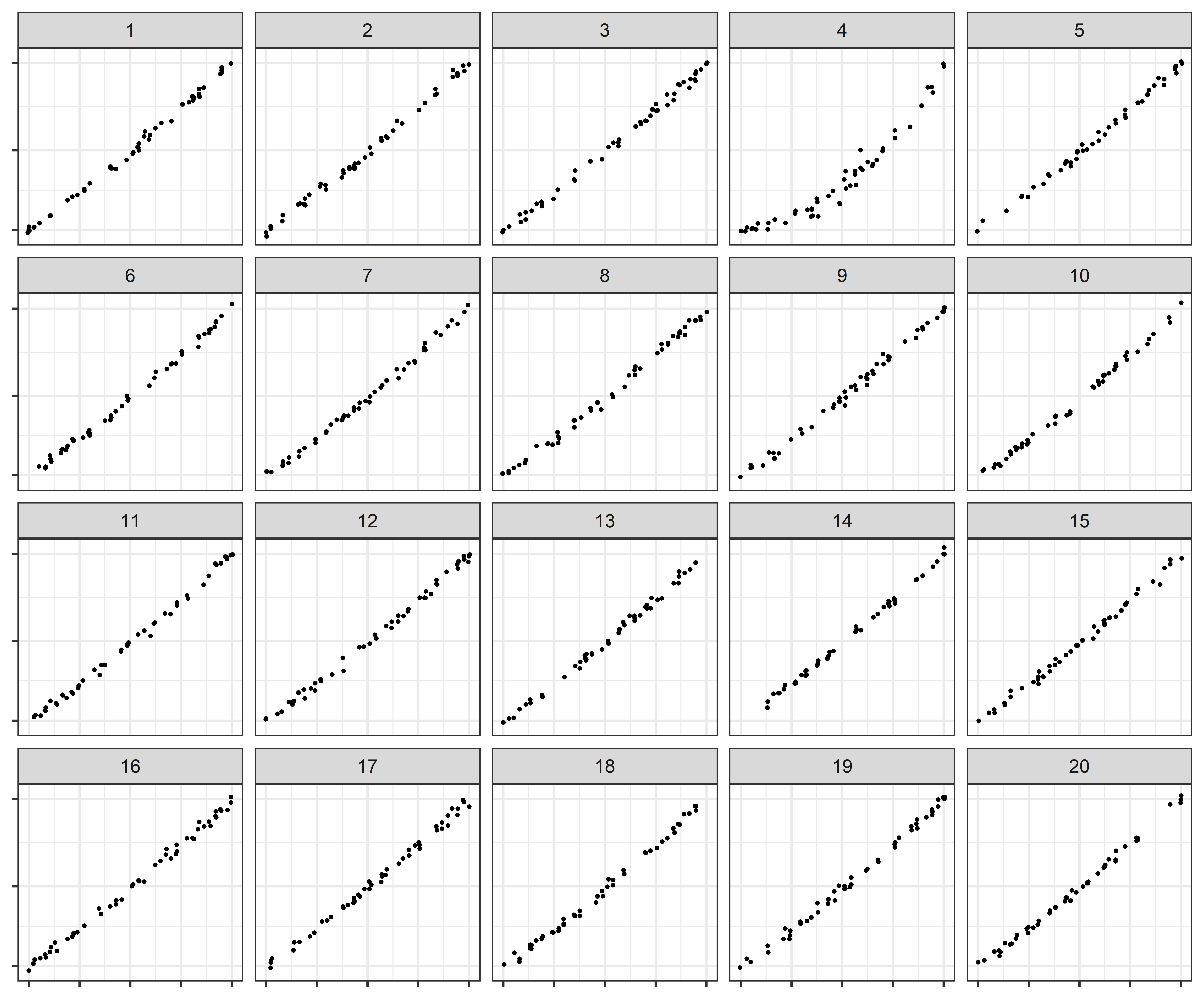
Log scales are often used to display data over several orders of magnitude within one graph. During the COVID-19 pandemic, we have seen both the benefits and the pitfalls of using log scales to display case counts. We explored the use of linear and log scales to determine whether our ability to notice differences in exponentially increasing trends is impacted by the choice of scale. We conducted a visual inference experiment in which participants were shown a series of lineup plots (consisting of 19 null panels and 1 target panel generated by differing model parameters) and asked to identify the panel that was most different from the others.
Read more →
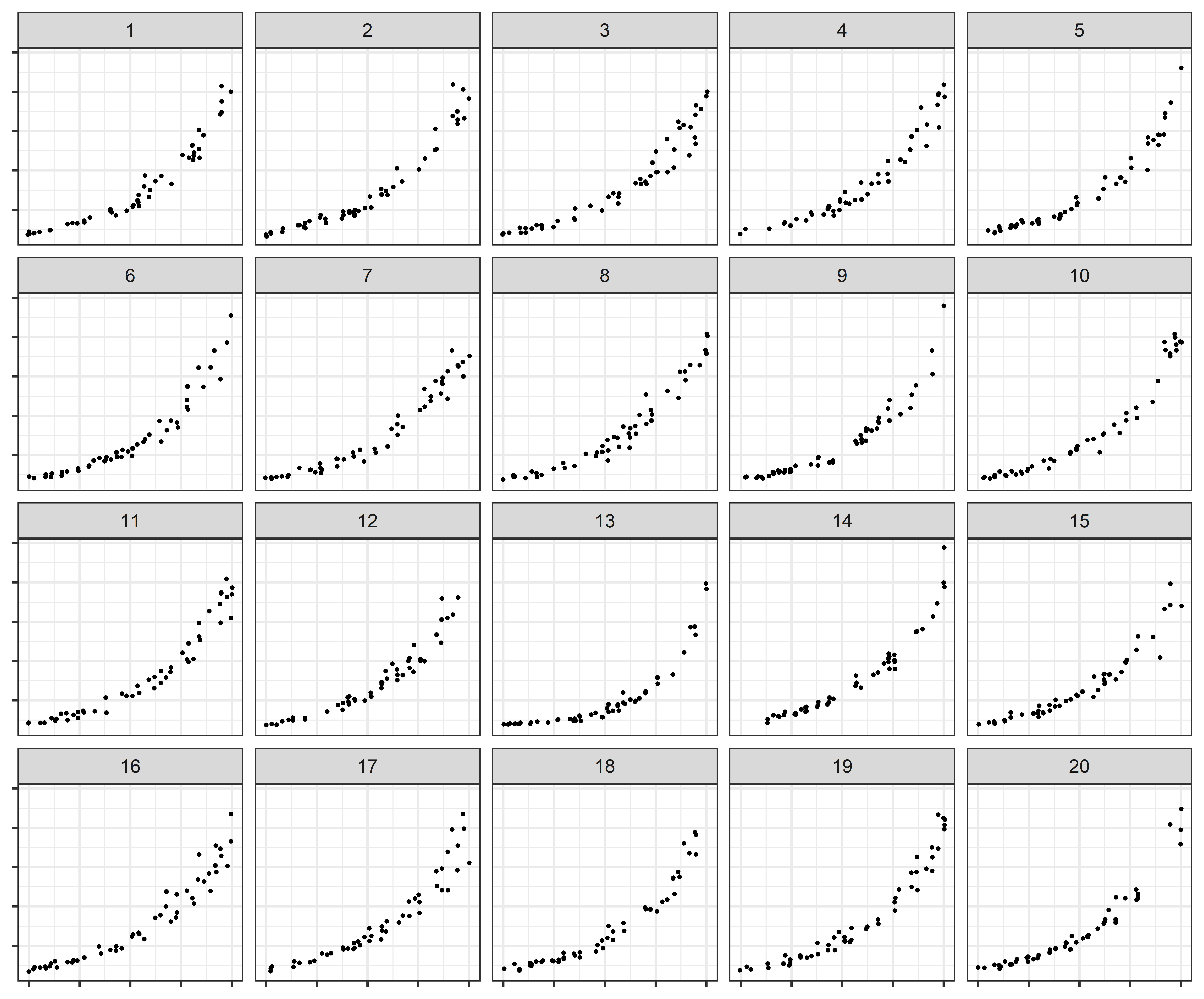
Log scales are often used to display data over several orders of magnitude within one graph. During the COVID pandemic, we’ve seen both the benefits and the pitfalls of using log scales to display data. In this week’s graphics group, we will test out an experiment designed to assess perceptual and cognitive biases in graphical displays of exponentially increasing data.
Read more →
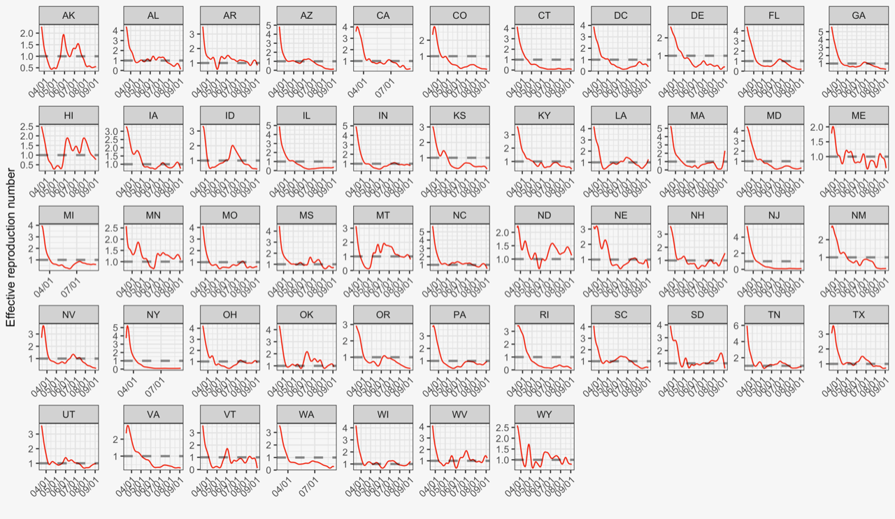
We estimate and assess the effective reproduction numbers of COVID-19 for 25 countries using an extended SEIR model. By comparing the countries’ reproduction curves over the first 4 weeks of the start of local transmission, we identify the successful strategies which may be useful for other countries to control the pandemic and the possible second wave. The study shows significant benefits in taking containment measures sooner with vigorous enforcement in reducing the effective reproduction number.
Read more →