Nitrogen (N) must be managed efficiently to reach profitability while limiting N losses to the environment. The late-season corn stalk nitrate test (CSNT) is a reliable evaluation tool for measuring corn N status and understanding of how N management practices perform at the field scale. The CSNT measures the nitrate (NO3−) concentration in the above-ground portion of cornstalks, which can be collected up to three weeks after black layer formation. Numeric results are usually interpreted into four N sufficiency categories: deficient, marginal, optimal, and excessive.
Read more →
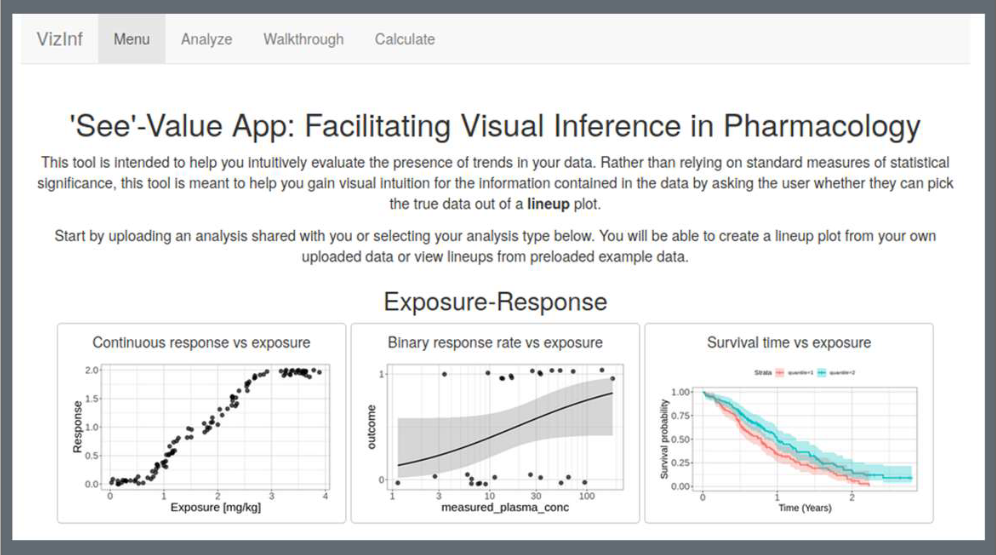
Humans are notorious at seeing patterns in plots even when there are none, especially when there is some incentive (e.g. financial) to do so. To avoid these pitfalls, the lineup protocol (Buja et. al 2009) calls for generating a number of simulated (“null”) plots and asking a user to try to pick out the real data from the rest. We created an R-shiny App that allows the user to generate these lineups by using preloaded examples or by uploading their own data.
Read more →
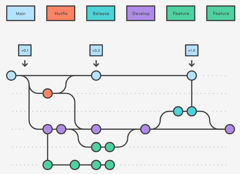
Having a standard workflow to follow is helpful to manage a complicated project, especially when multiple developers are involved. git flow provides git users with useful commands for following one such workflow. In this presentation, I will introduce a standard workflow for git users, provide intuition, give a short demo using basic commands of git flow, and a discussion on other kinds of workflow in the workspace. I will also talk about some concepts related to git (add, commit, pull, push, merge, branch, etc.
Read more →

How do statistical regression results compare to intuitive, visually fitted results? Fitting lines by eye through a set of points has been explored since the 20th century. Common methods of fitting trends by eye involve maneuvering a string, black thread, or ruler until the fit is suitable, then drawing the line through the set of points. In 2015, the New York Times introduced an interactive feature, called ‘You Draw It’, where readers are asked to input their own assumptions about various metrics and compare how these assumptions relate to reality.
Read more →

In the last couple years, the Tidyverse team has made a series of informative presentations, giving practical advice on how to “deal with” tidy evaluation: the framework used for non-standard evaluation in the Tidyverse. This interactive tutorial, available at http://ijlyttle.shinyapps.io/tidyeval/, has been reworked to focus on this practical advice: how to write functions for (1) Shiny apps, and (2) interactive use. The tutorial includes videos of the Tidyverse team’s presentations – which you might find interesting to watch in advance (or later).
Read more →