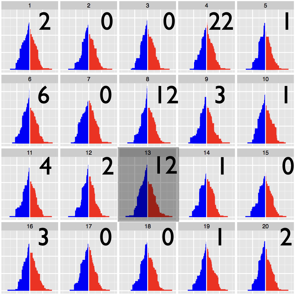
Statistical inference provides the protocols for conducting rigorous science, but data plots provide the opportunity to discover the unexpected. These disparate endeavors are bridged by visual inference, where a lineup protocol can be employed for statistical testing. Human observers are needed to assess the lineups, typically using a crowd-sourcing service. In this talk we will discuss how to calculate statistical significance associated with the results from applying a lineup protocol.
Read more →

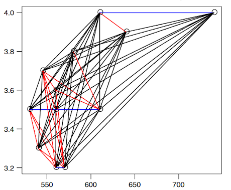
Capturing the relationship between covariates is an important part of statistical inference, but when the underlying relationship is not linear in nature, or when things like tail dependence come into play, our intuition begins to falter, especially in multivariate settings. In this talk, I will give an introduction to the more general concept of dependence modeling and how to think about dependence. I will give an introduction to some commonly used measures for capturing dependence, and ways of visualizing them.
Read more →

R is a popular programming language used by millions of people worldwide for data analysis and visualization. Rmarkdown is a notebook format that allows R users to weave code output and narratives in a single document, and is extremely popular among data scientists for authoring reproducible articles. RStudio is a popular integrated development environment (IDE) that enhances user experience of working with R. In this talk, I will share my top 20 tips and tricks that can help optimize the experience and make working with R, Rmarkdown, and RStudio, faster, easier and intuitive.
Read more →
Several classes of time deconstructions can assist in the exploration and automated analysis of large temporal data sets. Cyclic time granularities, which are temporal deconstructions accounting for repetitive behavior, like hour-of-day, day-of-week, or special holidays can be used to create a visualization of the data to explore for periodicities, associations, and anomalies. Analysts are expected to comprehensively explore the many ways to view and analyze such graphics, however, the lack of a systematic approach to do so quickly becomes overwhelming.
Read more →

Most people see math and art as two parts of the brain, one as logical one as emotional. The goal of art is to tell a story in a glance, isn’t that the same goal of a data visualization? Here we will take a look at the line between the left brain and the right brain in Data Art and discuss the functionality of adding emotion to the logic.
Read more →
