We use phrases all the time - “plain as day”, “right in front of you” - that suggest our visual system is infallible. When creating graphics, it is important to know when that assumption does not hold. In this talk, we’ll discuss different pitfalls, optical illusions, and bugs that affect the visual system.
The slides can be found here.
Read more →

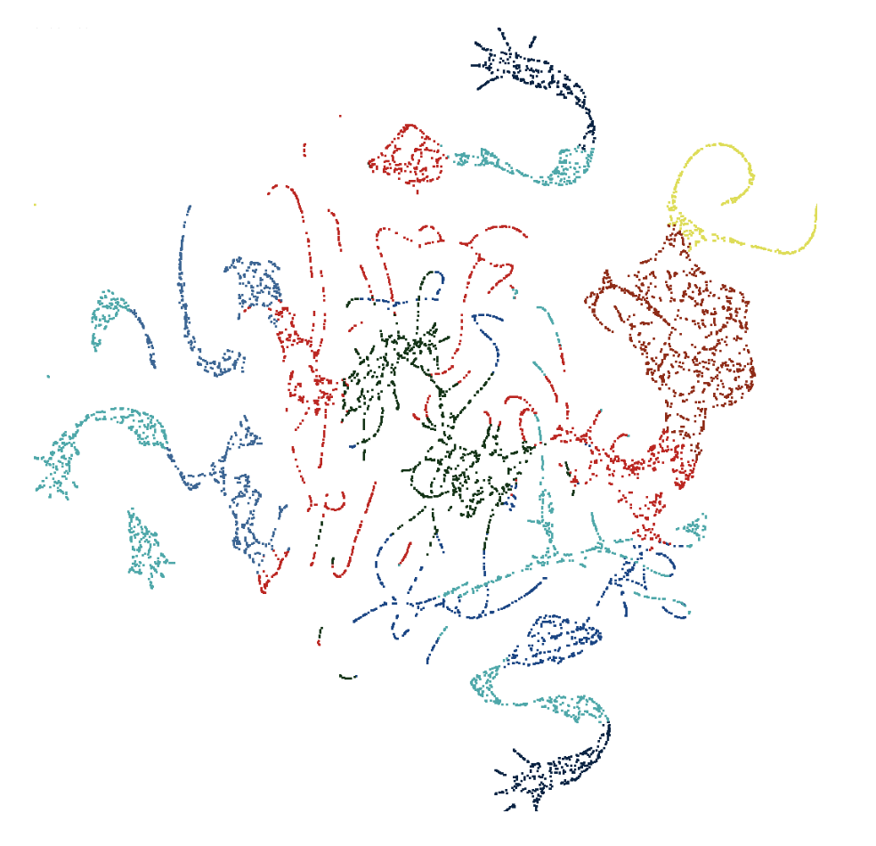
One of our fundamental tasks as data scientists, especially given our focus on statistical graphics, is to take a potentially large and messy dataset, and extract meaningful relationships and patterns from it. One such approach to this is dimension reduction, the task of reducing the number of variables in a dataset to a much smaller number that still captures the structure of the original data well. A commonly used technique for dimension reduction is PCA, or Principal Component Analysis, where transformations of the variables are made in order to extract a set of uncorrelated principal components from the data.
Read more →

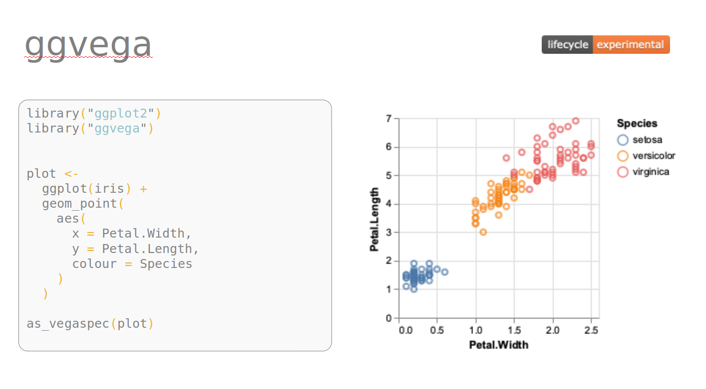
The ggvega package was created to translate from ggplot2 to Vega-Lite, inspired by the capability the R package plotly provides to translate from ggplot2 to plotly. In this talk, we will discuss the motivation and design philosophy behind ggvega as well as some of the roadblocks we encountered along the way. We will conclude with a demonstration of some fun use-cases.
Read more →

gganimate allows for the animation of ggplot2 graphics. The package has been around for a while, but it has been updated to allow for easier transitions from static ggplot2 graphic to animated versions. This talk is meant to be an interactive tutorial on how to use the updated version of gganimate. You are encouraged to bring a laptop to follow along. Since the talk will be given on Halloween, spooky datasets will be used to demonstrate the functionality of gganimate.
Read more →

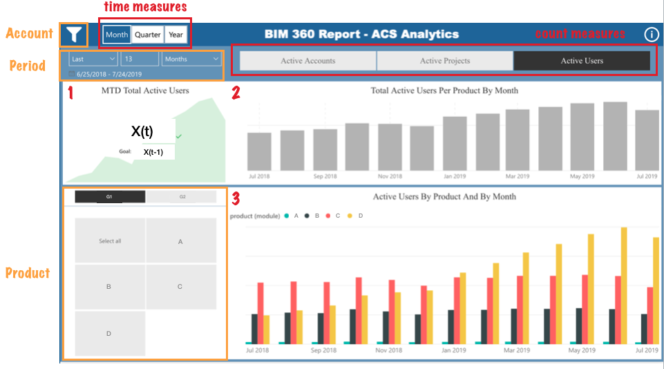
Interactive data visualization (dashboards) are often used to show important measures or key performance indicators (KPI) at a comprehensible level of aggregation and are continuously updated as new data are added to the database. In this talk, I’ll present a full procedure of developing a dashboard from data engineering to data visualization taken from my summer internship as a visualization analyst at Autodesk. Some recommended practices such as choosing appropriate charts and designing effective dashboards will be discussed.
Read more →

